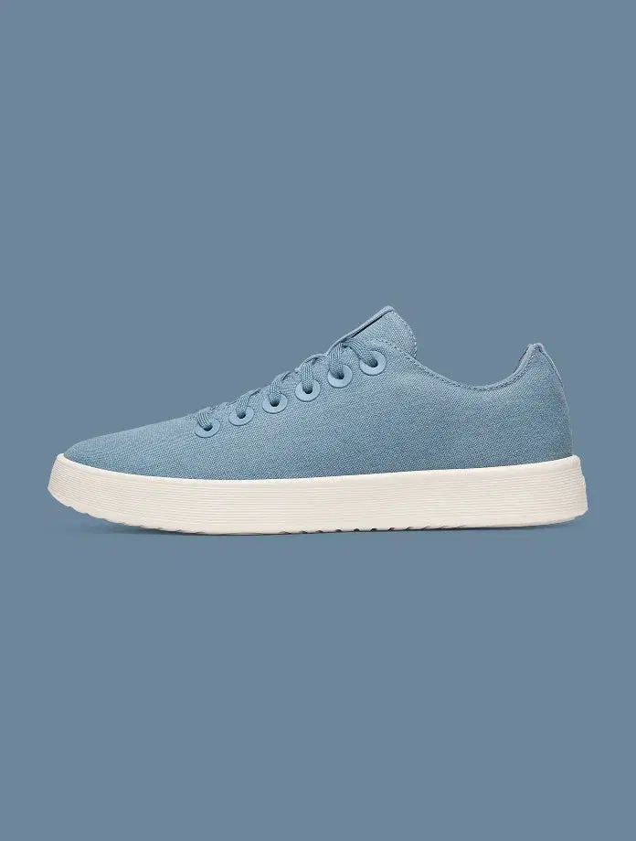
The seven-shot Shopify product gallery: a better photography brief
A practical seven-shot product-photography plan for Shopify, illustrated with real examples and designed around the questions a customer needs answered.
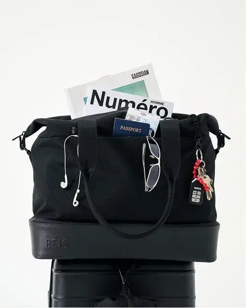 BÉIS
BÉISA gallery of seven nearly identical pictures is still one answer repeated seven times. A better sequence helps the customer resolve different uncertainties. Use this plan as a brief, then remove any frame that does not contribute something useful for your particular product.
01 / Identify the product
Start with the view that most clearly identifies the item and its selected variant. The object should be recognisable at collection-card size. Choose a composition that leaves important edges visible and remains useful when the storefront uses a different crop.
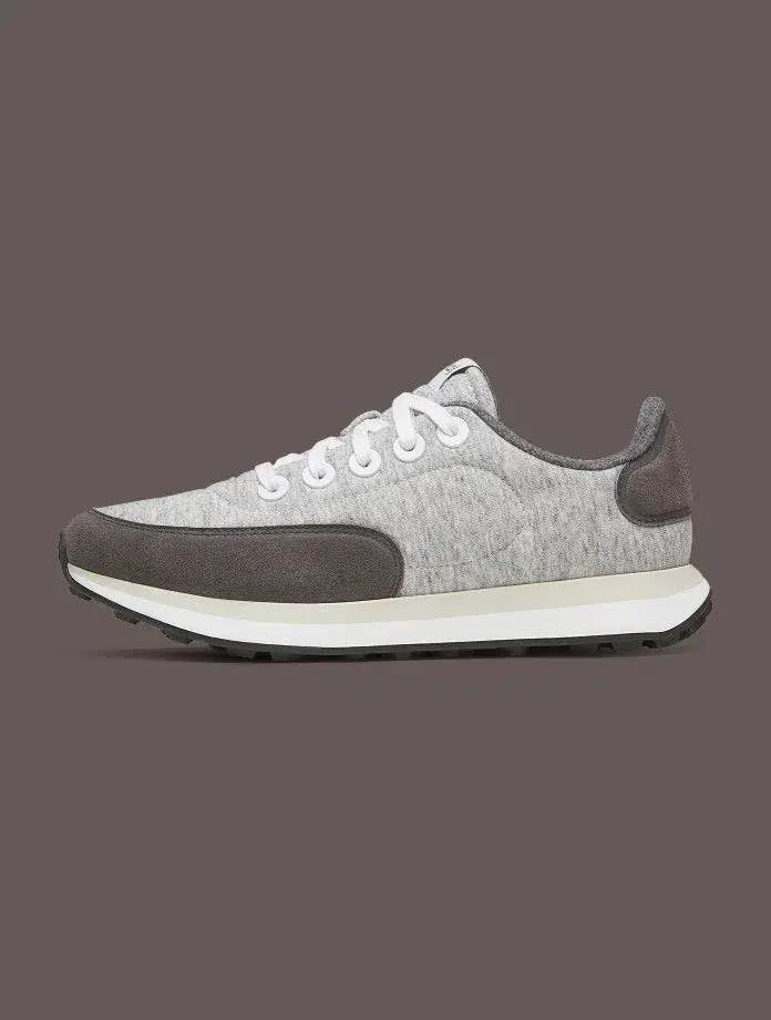
Reference / a clear identifying view
The shoe is isolated in profile with a restrained background. The upper, sole and overall silhouette are easy to separate visually.
Choose the identifying angle for the product you sell. Keep it consistent across comparable variants so a change in photography does not look like a change in the item.
02 / Show the side the first image cannot
A front view cannot explain the back panel of a backpack or the underside of a desk accessory. Add the angle that answers the next likely question. If turning the object reveals nothing useful, spend that frame on a more important detail instead.
03 / Make one important feature inspectable
Pick a feature that affects the buying decision: fastening, texture, join, pocket or control. Photograph it closely enough to understand, and keep the relevant area sharp. Add a brief explanation in text when its purpose is not obvious. Do not use a macro image to imply a material property you have not verified.
04 / Establish scale
Show the object in a believable relation to a person or familiar item. Publish exact measurements beside the gallery or in the product details. If compatibility matters, state the relevant dimensions or tested model precisely; an image of a laptop inside a bag does not prove that every laptop fits.
05 / Demonstrate a real use
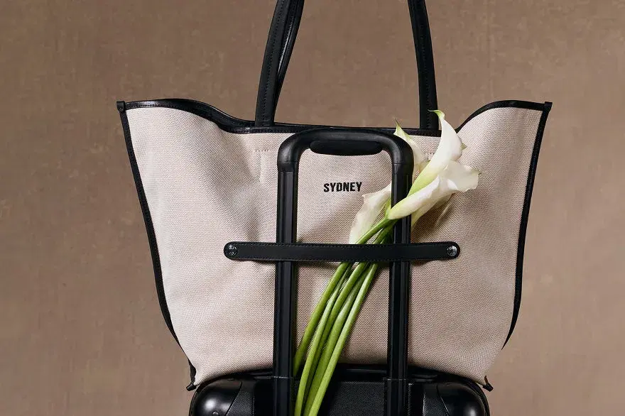
Reference / context with a purpose
A tote is styled with a tennis racket and a cap. The objects suggest a particular routine and help explain the role the bag could play.
Use props to clarify a use case. Make clear which items are styling only, and avoid implying tested compatibility from an attractive arrangement.
06 / Explain what arrives
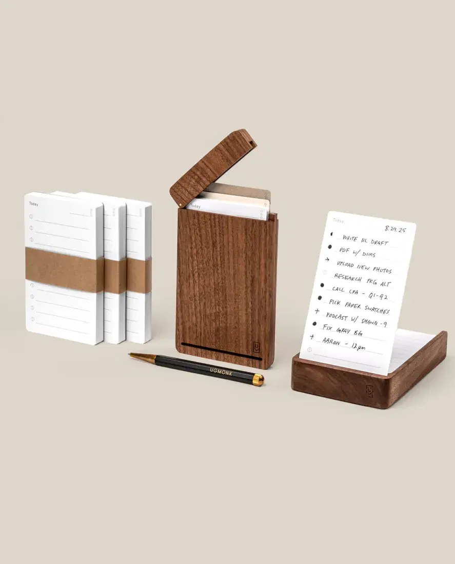
Reference / the components view
The Analog bundle is shown as a set of related pieces. The viewer can distinguish the holder, cards and accessories without reconstructing them from separate images.
Photograph the selected bundle accurately. Match the written contents to the picture and update both when the offer changes.
07 / Clarify variants and choices
When colour, size or configuration changes the product materially, show the difference. Connect variant selections to appropriate images where the theme supports it. Avoid a gallery that keeps showing the hero colour after the shopper chooses another. An attractive comparison should reduce ambiguity rather than introduce more options than the page actually sells.
Check the sequence in the storefront
- Inspect the default image and selected variant on mobile.
- Make sure zoom is useful for details without requiring oversized files everywhere.
- Write image descriptions for their actual content and context.
- Keep essential measurements and instructions in accessible text.
- Reserve image dimensions to reduce layout movement.
- Review loading behaviour before adding video or more gallery widgets.
This is an original planning framework illustrated with credited brand examples. It is not a claim that a seven-image gallery outperforms every shorter one. The right number is the number that answers the relevant questions clearly, within a page that remains easy to use.
If you are using AI to prepare the assets, compare Shopify Magic and Photoroom.
We study the whole buying journey.
Our work stays focused: Shopify SEO and GEO.