6 product photography examples worth studying for your Shopify store
A curated contact sheet of product photography from Allbirds, Blueland, BÉIS, Gymshark and Ugmonk, with a practical lesson from every frame.
 Allbirds
A beautiful product photograph can still leave the shopper with every important question unanswered. This collection looks at photographs with a job to do. The selection is editorial: six frames we find useful for studying product communication, not a ranking based on sales performance.
The images are from the credited brands’ public storefronts, reviewed on 19 September 2026. They are reference examples, not our production work, and inclusion does not imply an endorsement or client relationship. Follow the source links to explore the original context.
01 / Silhouette: let the shape speak
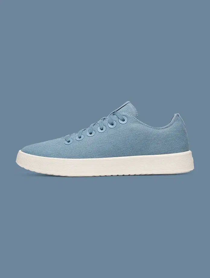
A blue shoe sits in profile against a related blue ground. The separation between the upper and the pale sole keeps the shape readable. There is very little competing with the object.
Use one consistent identifying angle across a range. Check edge separation at thumbnail size, and do not let the background change how the product colour is perceived.
02 / Contents: show the relationship
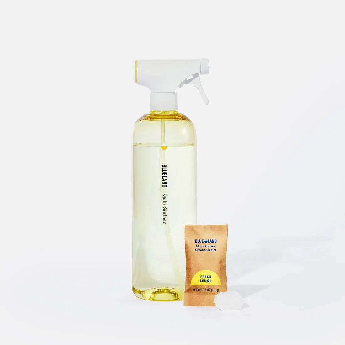
The bottle and refill packet share the frame. Their arrangement communicates that the offer belongs to a system, while the pale background keeps attention on the objects.
For a kit or refill product, show the relationship between parts. State in the caption and page copy what is actually included in the selected purchase.
03 / Range: make the family visible
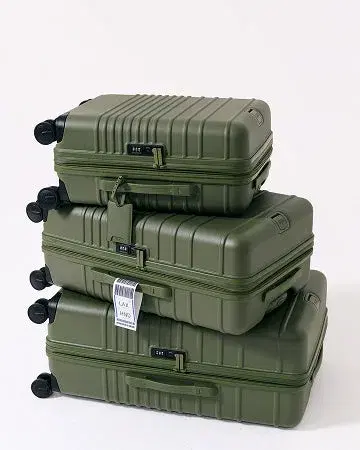
Three green suitcases stack in descending size. A repeated colour and similar viewing angle make the relationship among them easy to recognise.
Give a product family a comparison frame, then supply dimensions in text. Perspective and stacking can suggest size, but they are not measurement tools.
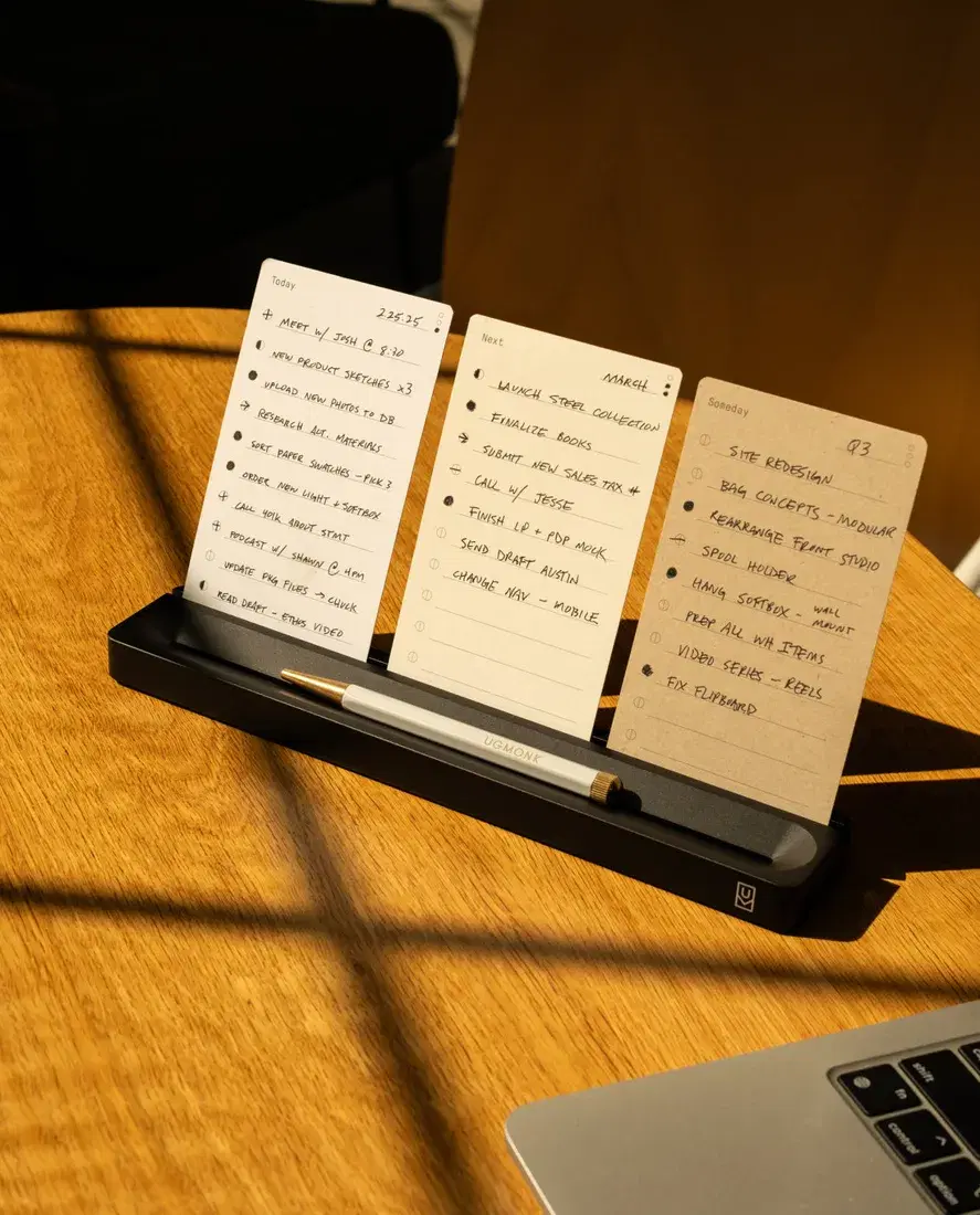
04 / Use: show what happens next
The desk stand holds handwritten cards in a patch of sunlight. A nearby laptop places the object inside a working environment. The viewer can recognise a purpose for the stand.
Photograph a real task. Ask what a customer should understand after seeing the frame, and remove props that do not help explain it.
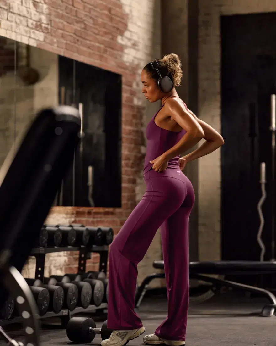
05 / Context: give the product a believable setting
The clothing is shown on a person in a gym setting. The full-length composition makes the outline of the outfit visible, while the equipment supplies context.
Use context to support the product’s intended role. Pair the scene with clear fit, fabric and measurement information rather than treating the photograph as proof of performance.

06 / Detail: make construction inspectable
A close view of a leather journal brings the edge and disc binding forward. The narrow focus directs attention to a particular part of the object.
Choose details that explain a buying-relevant feature. Add a wider view so the customer knows where the detail belongs and how it relates to the whole product.
Turn the collection into your next shoot brief
Write the customer question above each planned frame. “What does it look like?” needs an identifying view. “How large is it?” needs a trustworthy scale reference and measurements. “What arrives?” needs a contents view. This makes the brief easier to judge than a string of aesthetic adjectives.
- Keep product and variant identity consistent throughout the gallery.
- Use actual objects for size references; state measurements separately.
- Distinguish included components from styling props.
- Review colour and small details against a trusted original.
- Check the images in the real mobile product gallery, not only on a large monitor.
Help the image work on the page
Write alt text that describes the image in context. Put critical specifications and instructions in visible text. Give the gallery sensible image sizes and reserve its space so the page does not jump while assets load. A well-made photograph still needs a well-made implementation.
When you assess results, choose an appropriate question: did customers use the comparison, understand what was included or ask fewer avoidable questions? An image’s inclusion in this collection is not proof that it increases conversion. It is a useful starting point for an original brief and a measured improvement.
Build the full sequence with our seven-shot product-gallery plan.
We study the whole buying journey.
Our work stays focused: Shopify SEO and GEO.