Blueland’s Shopify store: making a refill model easy to understand
What Shopify merchants can learn from Blueland’s starter-kit and refill journeys, product grouping and clear explanation of a different way to buy.
 Blueland
A refill model creates two customers with different questions. The first wants to understand the system. The second wants to replace the bit that ran out. Giving both people the same long introduction can make an otherwise simple purchase unnecessarily complicated.
Two journeys, visible from the start
Blueland’s public store separates starter kits and refills in its navigation. It also organises products by household task. That combination helps explain both how to begin and where to return. We are studying the clarity of those routes, not attributing the company’s results to a navigation label. Blueland storefront ↗
The bottle and the refill belong in the same explanation
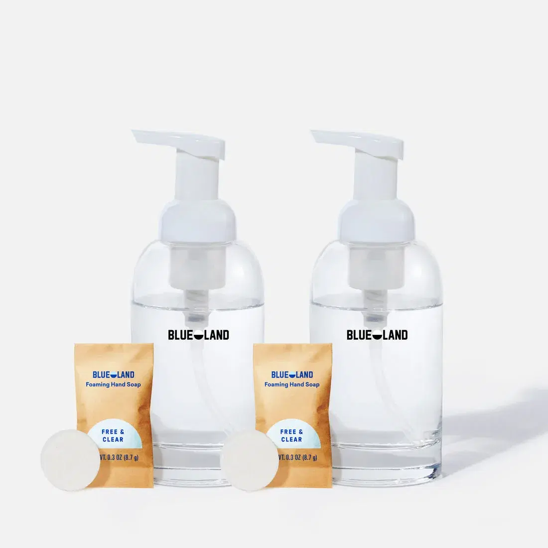
The two bottles and packets are photographed together. The relationship between container and refill is visible without a long caption.
For a system product, show the components together and explain which are included in the selected offer. Photography should agree with the purchase options.
Explain the offer before the philosophy
A mission can earn attention, but a product page still needs to answer ordinary questions. What arrives? How is it used? What will I need next? When building a starter-kit page, write those answers before polishing the brand manifesto. Keep instructions specific and avoid implying that an illustrated component is included when it is sold separately.
On a refill page, let the returning customer check compatibility and quantity quickly. If several containers or generations exist, give the exact matching information. A returning buyer should not need to reconstruct the original launch story just to reorder.
A small system, shown in one frame
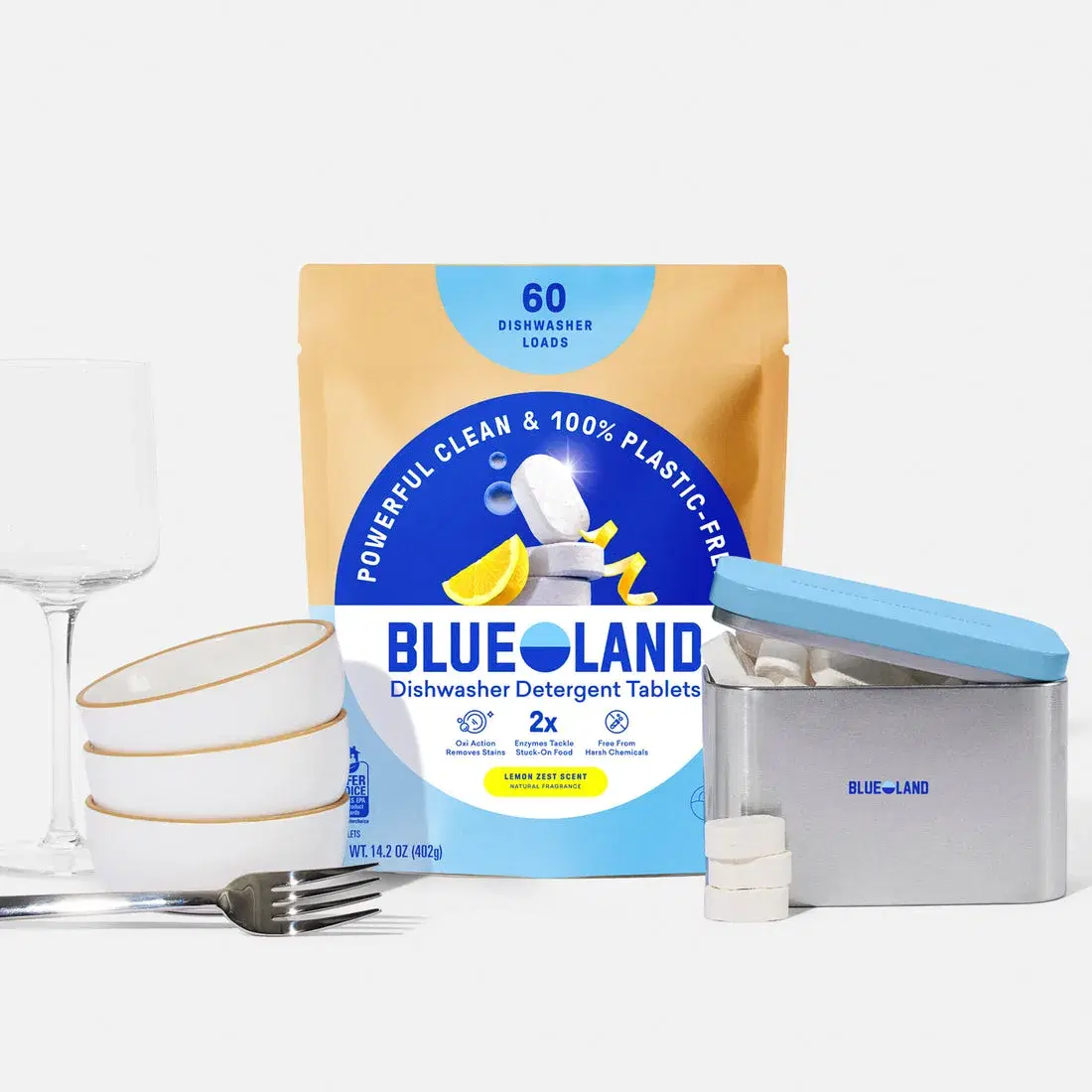
Tablets, packaging and a storage tin appear together. Each object has a role in explaining the offer, rather than serving as unrelated decoration.
Create a components list before the shoot. Mark included, optional and illustrative items, then carry the same distinctions into the page copy.
Build useful search destinations around real needs
For a merchant adopting a similar structure, the starter kit and the refill can serve different buying needs. Give them distinct descriptions, clear internal links and accurate product data. Avoid copying the same paragraph across both and changing only the product name. The first page explains adoption; the second supports continuation.
| First purchase | Repeat purchase |
|---|---|
| What is in the kit? | Which refill fits what I already own? |
| How do I start using it? | How much do I need? |
| What can I use it with? | Has the formula, size or compatibility changed? |
| What happens after it runs out? | Can I order once, and what does a subscription change? |
Keep claims specific and supportable
If you sell around a materials or environmental proposition, identify the exact component and the scope of the claim. Do not let a general brand statement substitute for product-level information. A customer comparing two offers needs something more precise than a green colour palette.
The same discipline supports useful answers across search and customer service: accurate quantities, instructions, compatibility and limitations. A structured field is valuable when it records a true fact; adding more fields does not make an unsupported claim safer or more useful.
For the product information behind this approach, read our Shopify product-page guide.
We study the whole buying journey.
Our work stays focused: Shopify SEO and GEO.