6 standout Shopify brands and what their stores get right
Study Gymshark, Blueland, Ugmonk, BÉIS, Allbirds and Cotopaxi for useful lessons in navigation, product explanation, photography and buying confidence.
 BÉIS
BÉISStudying a successful store is useful until the exercise becomes copying its colours. A small merchant does not inherit a large brand’s audience by borrowing its homepage. The better question is: what buying decision does this experience make easier, and how could that principle apply to our own catalogue?
What earns a place in this collection
We selected six brands with Shopify merchant stories and visible examples worth discussing. The observations below come from public storefronts reviewed on 19 September 2026. They are editorial interpretations, not access to the brands’ analytics, a technical audit or evidence that a particular design caused commercial growth. None is presented as an agency client.
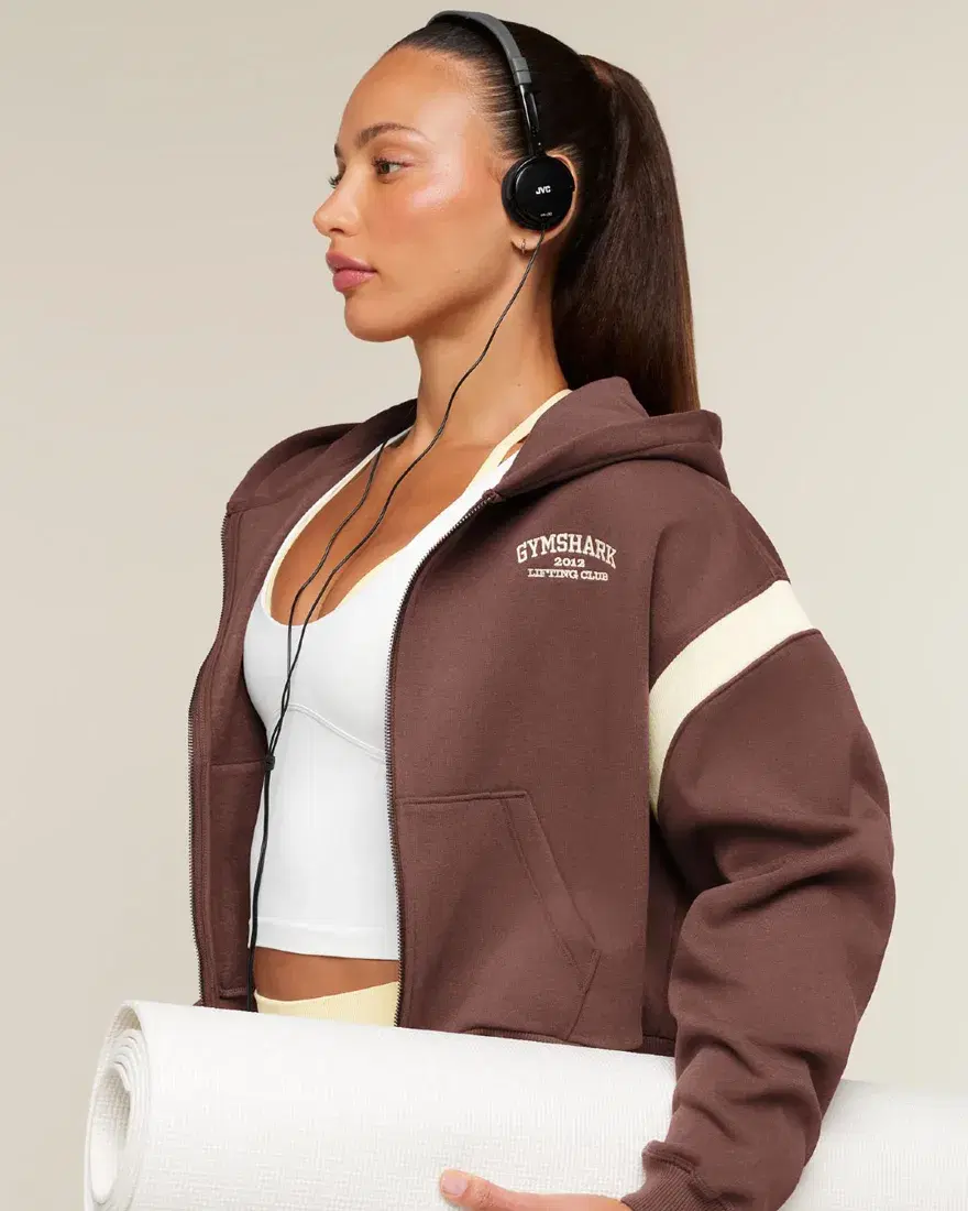
01 / Gymshark: more than one route to the right product
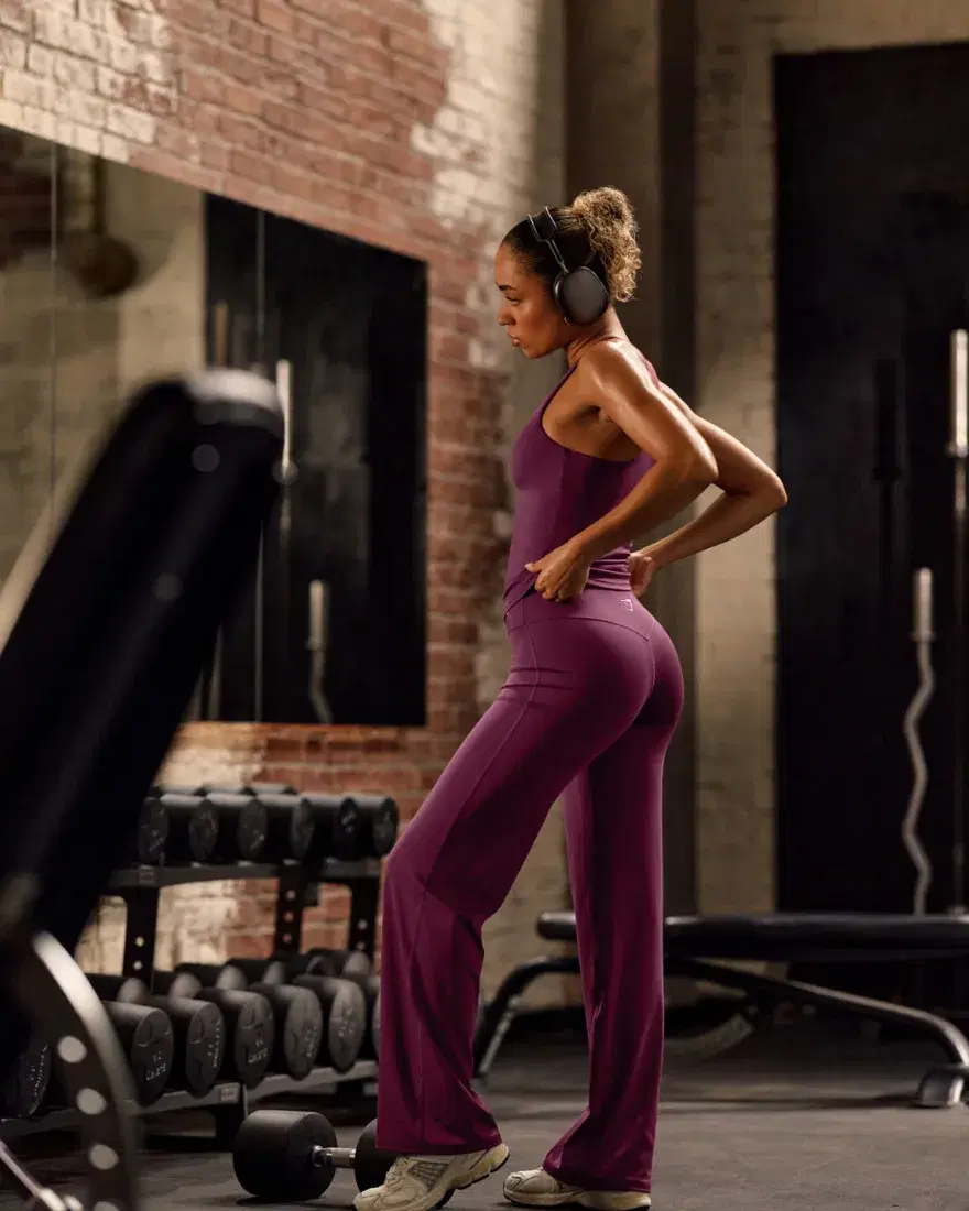
Gymshark’s navigation offers routes by product type, collection and activity, alongside buying guides. That recognises a simple difference: some visitors know the item they want; others know only what they want to do.
Map one important category by product, use and fit. Keep each route useful and distinct, rather than creating an indexable page for every possible filter.
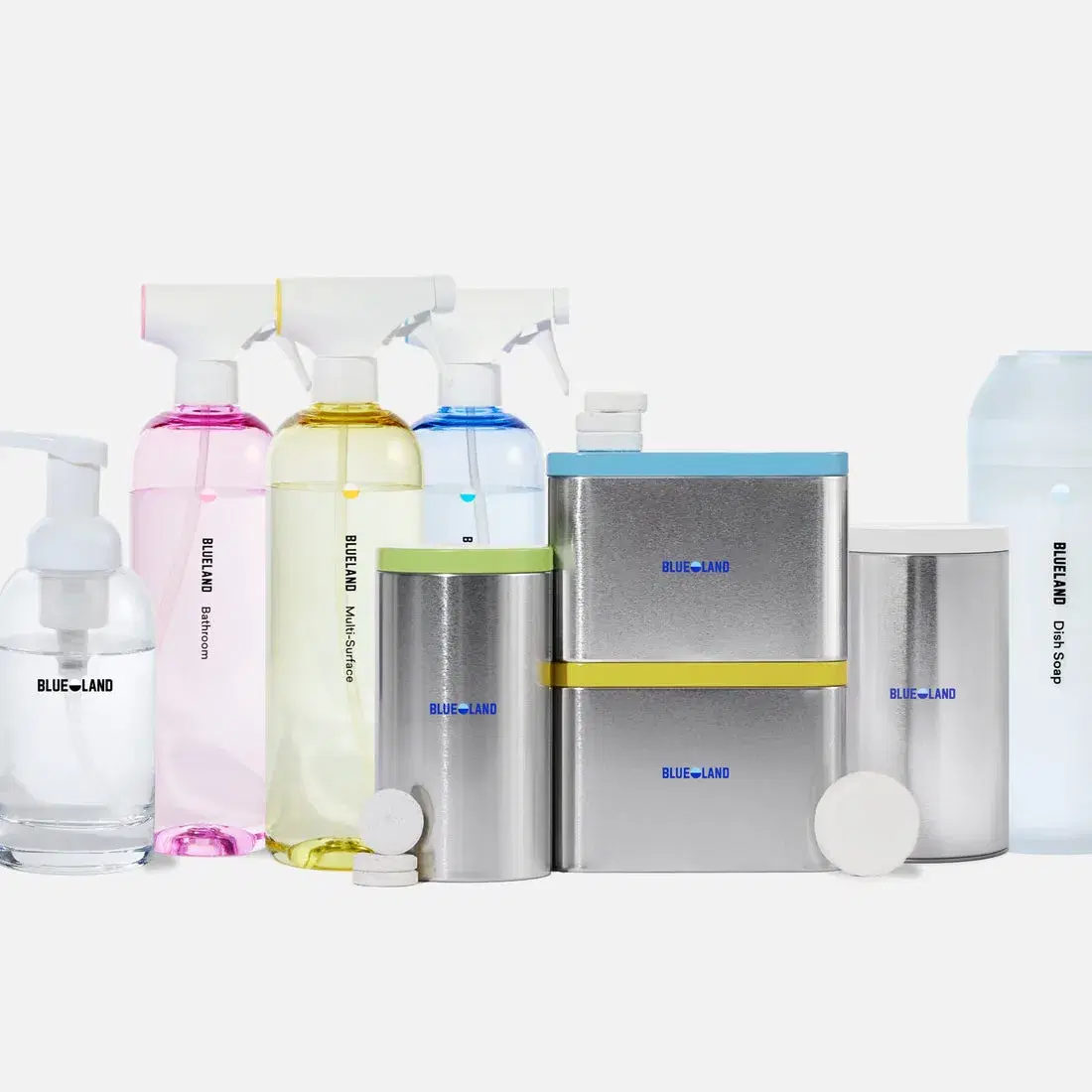
02 / Blueland: separate the first purchase from the next one
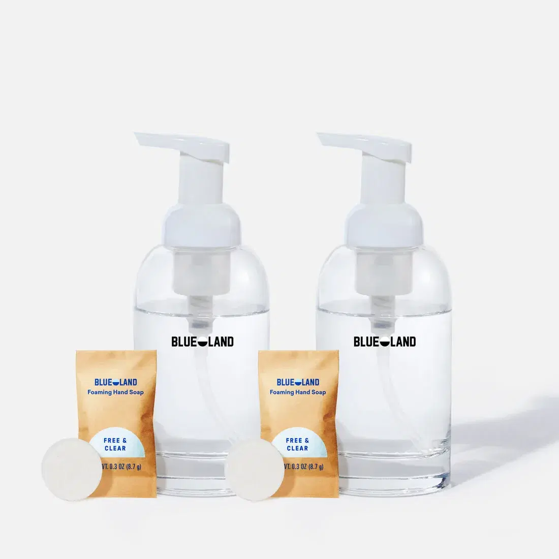
Starter kits and refills are visibly distinct shopping routes. A new customer needs to understand the system; an existing customer often needs to replace one part of it.
Give first-time and returning buyers clear destinations. Explain what is included, what is reusable and what needs replenishing in language specific to the product.
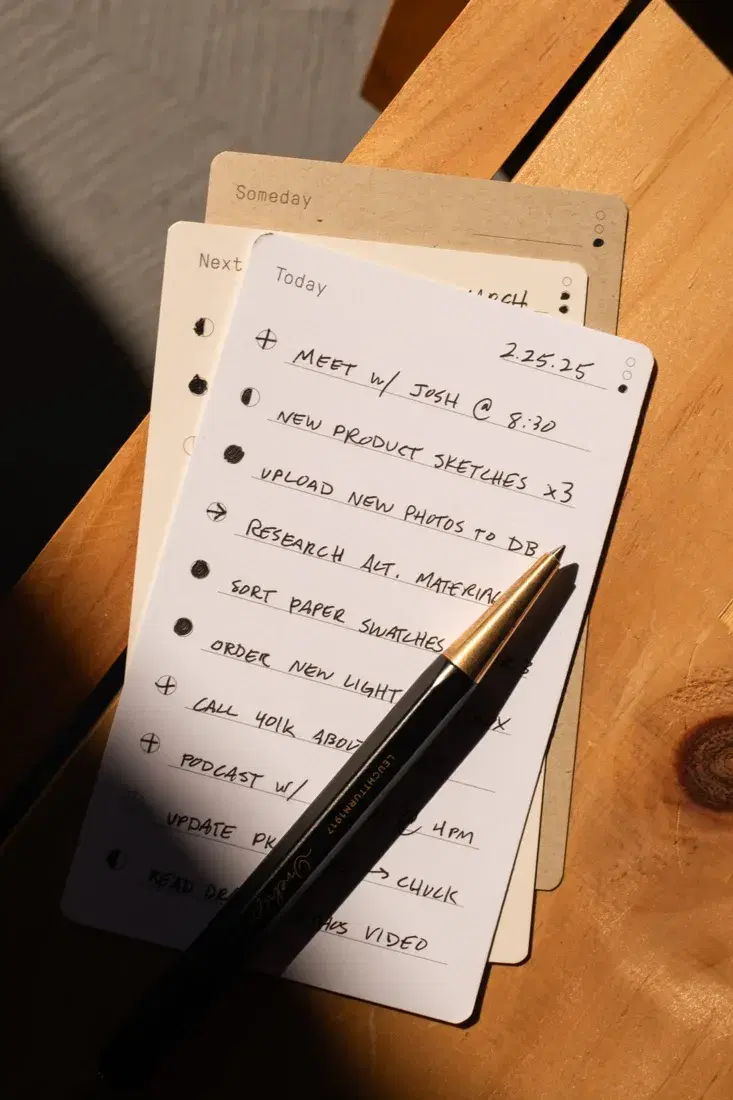
03 / Ugmonk: explain the habit around the object
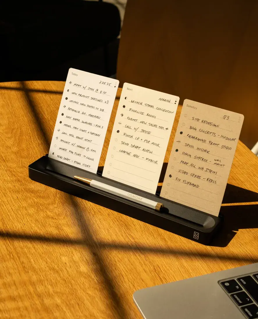
A task card photographed with handwriting and a pencil shows a small daily ritual. The customer sees a way to use the product, rather than only a material and a price.
Pair the clean product view with an honest example of use. Write the instructions and dimensions in text as well as illustrating them.
04 / BÉIS: make a range easier to compare
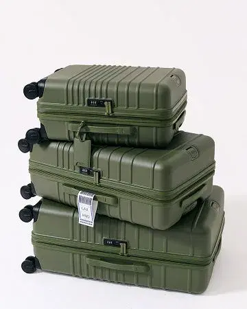
A stack of coordinated luggage gives the range a visual relationship. The store also offers routes by use, size and colour, helping visitors approach the catalogue from different decisions.
Support range photography with a comparison of verified dimensions, weight and included features. A picture can introduce the choice; precise specifications should complete it.
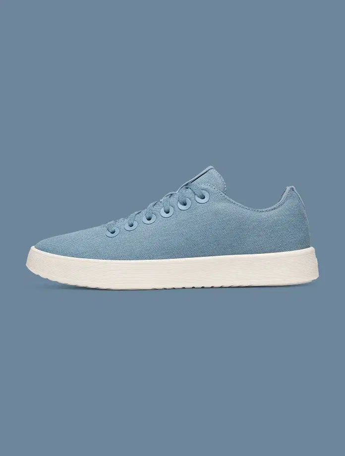
05 / Allbirds: give the product room to be recognised
A single shoe in profile on a restrained background makes silhouette, sole and colour easy to inspect. The composition does not require the shopper to decode a complicated scene.
Use a consistent identifying view across variants, then add distinct images for texture, fit and use. Keep product colour accurate across the sequence.
06 / Cotopaxi: organise an unusual catalogue around the customer
Shopify’s Cotopaxi story discusses the challenges of merchandising distinctive products and offering different routes to them. The useful principle is that an unusual product range still needs a legible shopping structure. Cotopaxi — Shopify merchant story ↗
If your products vary in ways that matter—colour combinations, materials, compatibility or availability—explain those rules at the point of choice. Do not rely on the brand story to answer a practical product question. Use the story to create interest and the catalogue to support a decision.
Borrow the decision, then design your own answer
| Observed strength | A question for your store |
|---|---|
| Multiple shopping routes | Can a visitor who knows the use case but not the product name find the right category? |
| Starter/refill separation | Does a returning customer have to repeat the new-customer explanation? |
| Product in use | Can someone explain how the item works after looking at the gallery? |
| Range comparison | Are the differences between similar products explicit? |
| Recognisable imagery | Can a shopper identify the selected variant immediately? |
Choose one question, improve the relevant page and record what changed. Track appropriate behaviour such as guide use, product comparison or avoidable support questions. Treat any commercial effect as something to measure, not something a moodboard has already proved.
For the search structure behind those choices, read our collection-page guide.
We study the whole buying journey.
Our work stays focused: Shopify SEO and GEO.