What search-ready Shopify brands do differently
Five observable SEO and GEO patterns from Allbirds, Gymshark, BÉIS, Blueland and Ugmonk—and a practical way competitors can apply each one.

The phrase “good GEO” can encourage bad theatre: a few synthetic FAQs, a new acronym in the footer and a dashboard full of mentions. Strong commerce content is less mysterious. It helps a specific customer make a decision, publishes facts the business can maintain and connects those facts to the products being sold.
The five brands below are examples of observable content and merchandising patterns. We are not declaring them winners in Google or AI answers, and we have no access to their internal performance data. The point is to turn visible strengths into testable work for another store.
1. Allbirds makes product families comparable
The Tree Runner collection names related models and gives each a compact role. Individual product pages add materials, fit, measurements, care and intended uses. Together, the family page and product page answer different levels of the decision. Allbirds — Tree Runner collection ↗
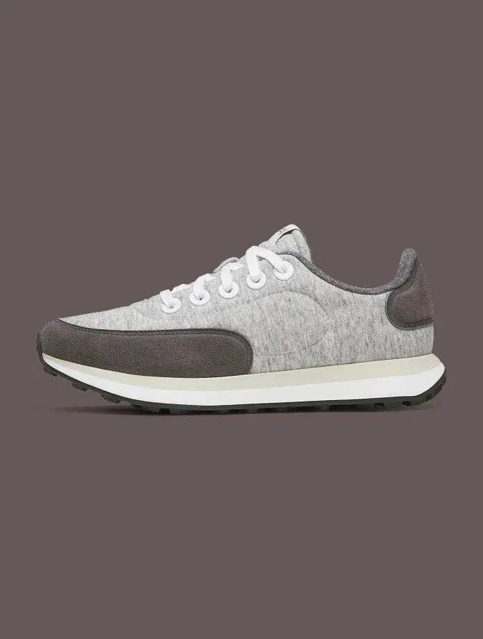
Recognisable model, consistent frame
A restrained profile image makes the shoe and colour easy to identify across the range.
Build consistency in the identifying frame, then use additional images and text to explain material, fit, scale and use.
2. Gymshark offers more than one route into the catalogue
Gymshark’s leggings guide lets shoppers begin with fit and use, while its navigation also supports product types, activities and named collections. Competitors can learn from the plurality of routes while remaining selective about which pages deserve to be indexed. Gymshark — Leggings Guide ↗
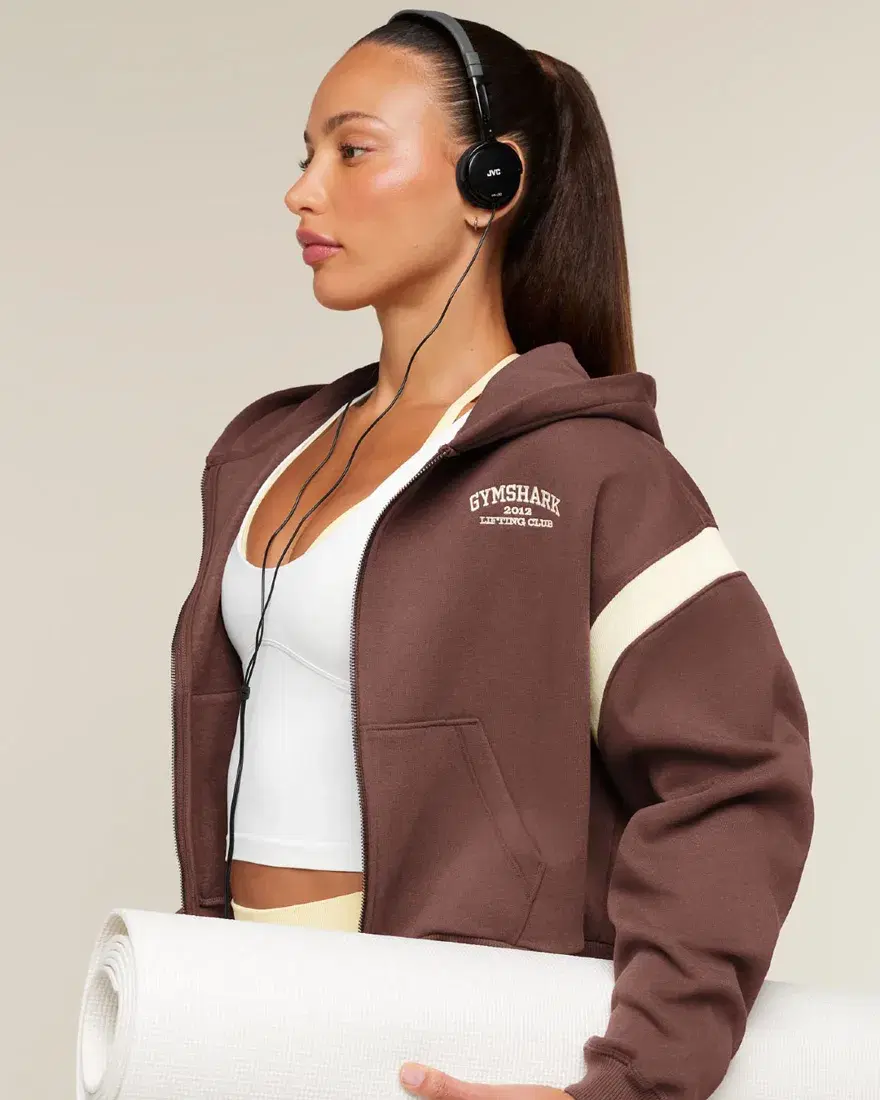
The product is connected to an activity
The visual context supplies a use setting while the store’s guides and categories provide the crawlable route.
Create useful activity pages only where the product set and advice are distinct. A generated page for every activity-tag combination is not a strategy.
3. BÉIS turns specifications into a comparison
The BÉIS carry-on range presents dimensions, weight, capacity and features in a comparable structure. The same information becomes more useful when it answers the trade-off: smaller airline footprint, more capacity, expansion or laptop access. BÉIS — Carry-On Luggage ↗
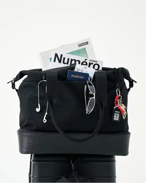
Context makes capacity easier to imagine
A packed bag shows the intended use, while the product page supplies the exact measurements the image cannot establish.
Combine context with measurable facts. Neither lifestyle imagery nor litres alone tells the complete story.
4. Blueland separates starting from replenishing
Blueland distinguishes starter kits from refills and explains what is included in the first order. That creates clearer pages for two different intents and makes the relationship between reusable vessel and consumable easier to state. Blueland — Clean Essentials Kit ↗
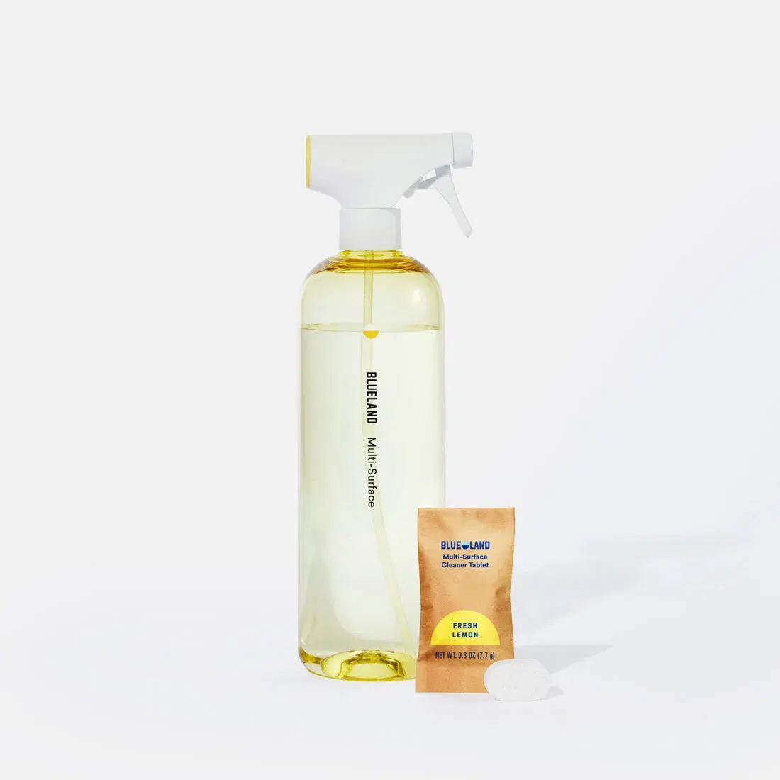
The product and refill are shown together
The bottle, packet and tablet make the system legible as a relationship rather than a lone object.
Name the compatible system in text, show both components and keep subscription terms separate from basic product facts.
5. Ugmonk sells the ritual around the object
Ugmonk’s Analog imagery shows cards, holder and handwriting in the context of a daily planning habit. The scene helps explain how a simple object is used; detailed product copy can then handle materials, contents and format.
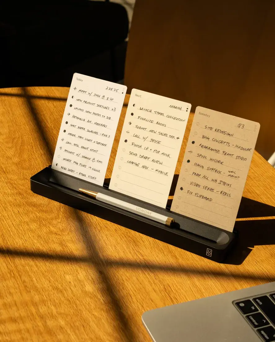
Use is visible
The holder and handwritten cards show a repeatable behaviour instead of leaving the customer with an isolated desk object.
Show the product doing its actual job, then describe the steps and included parts in accessible text.
| Pattern | Page to inspect | Evidence to add | Primary measure |
|---|---|---|---|
| Product family | Collection or comparison guide | Consistent model differences | Relevant non-brand queries and product continuation |
| Multiple buying routes | Navigation and category pages | Distinct use, fit or product intent | Landing-page engagement and assisted product visits |
| Comparable specifications | Product and category pages | Units, conditions and limitations | Comparison use and support-question reduction |
| Lifecycle architecture | Starter, refill and replacement pages | Compatibility and what arrives when | Successful repeat route and fewer compatibility errors |
| Product in use | Gallery and explanation | Steps, context and included parts | Gallery interaction and avoidable “how does it work?” questions |
What competitors should do first
- Choose the product family already receiving impressions or support questions.
- Write the decision fields shared by every item in that family.
- Create one comparison or guide that has a distinct customer job.
- Improve the underlying product facts before adding summaries or FAQs.
- Connect the guide, collection and products with useful internal links.
- Check the same facts in visible content, structured data and feeds.
- Track search queries, product continuation, assisted outcomes and recurring answer-engine observations separately.
How this becomes GEO without becoming nonsense
Good GEO work makes a store easier to retrieve, understand and cite. That means accessible pages, consistent entities and offers, self-contained explanations, comparison criteria and independent evidence where appropriate. It does not mean promising a citation or writing for an imaginary “AI algorithm.” Google’s published guidance says the same SEO best practices remain relevant to its AI search experiences. Google Search Central — AI features and your website ↗
Score the technical, content and AI-discovery foundations with the free Shopify SEO and GEO scorecard.
We study the whole buying journey.
Our work stays focused: Shopify SEO and GEO.